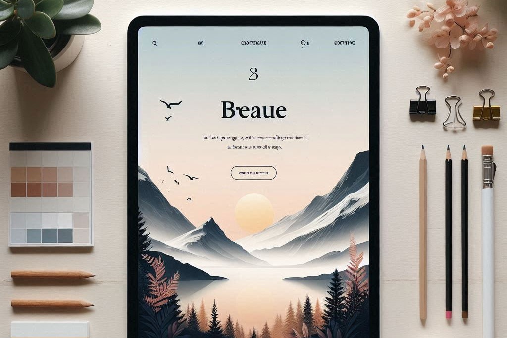
In the ever-evolving landscape of website design, minimalism is making a significant impact. As users increasingly demand faster, more efficient online experiences, ultra-minimalist designs featuring elegant and sophisticated aesthetics are gaining traction. This design philosophy prioritizes simplicity, ensuring that every element serves a purpose and contributes to a seamless user experience.
One of the primary benefits of minimalism is its focus on fast load times. In a digital world where attention spans are shrinking, websites that load quickly are essential for retaining visitors. By reducing clutter and unnecessary elements, designers can create pages that not only look clean but also perform efficiently. This streamlined approach minimizes distractions, allowing users to engage with the content that truly matters.
Clear borders and visible structure are key components of minimalist design. These features help to simplify navigation, guiding users effortlessly through the website. A well-defined layout enhances clarity, making it easy for visitors to find what they’re looking for without feeling overwhelmed. By using ample white space, designers can create a sense of balance and harmony, further enhancing the overall user experience.
Moreover, minimalism is not just about aesthetics; it reflects a deeper understanding of user behavior. With fewer distractions, users can focus on the content, whether it’s reading an article, browsing a product catalog, or filling out a contact form. This user-centric approach fosters engagement and encourages visitors to explore the site further.
In conclusion, the rise of minimalism in website design is a response to the growing need for efficiency and clarity in the digital space. By embracing ultra-minimalist designs, businesses can create elegant, sophisticated websites that prioritize user experience, ensuring that visitors leave with a positive impression. As we move forward, this trend is likely to continue shaping the future of web design.


